More Cyanotype Toning
I've been slowly working on a series of photographs of the Tappan Zee Bridge that I've wanted to print as cyanotypes.
The images really lend themselves to monochrome, and there's something about the blue of the water and the cyanotype blue that seems to work. That said, I did want to play around with some toning to introduce additional visual interest.
I've experimented with cyanotype toning before, but I thought this would be a good opportunity to try out some of the toning techniques from Annette Golaz's excellent book Cyanotype Toning.
This is really an amazing book. If you're working on cyanotypes at all, you have to pick up this book. Besides the great technical content, the work shown by Annette and other highlighted artists is incredibly inspirational.
I've been really happy with most of these. There's still some details I want to improve, but overall I like the direction they are going.
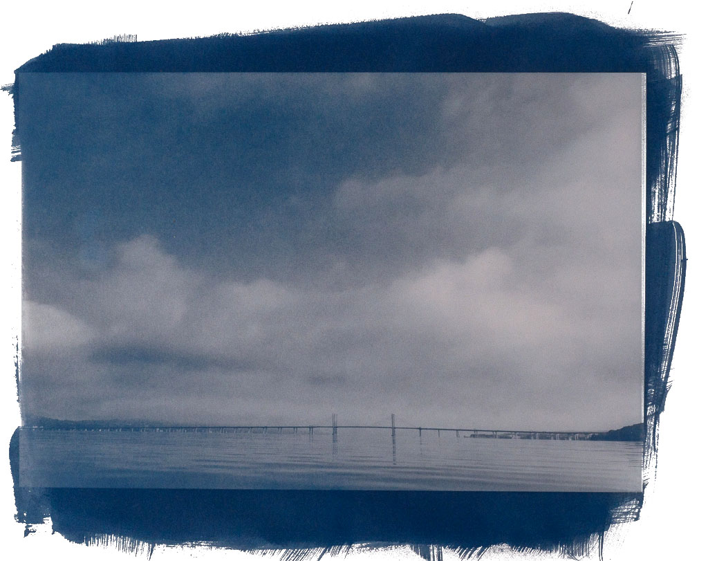
This is one of my favorites. Pink Peppercorn (which is actually a berry!), produces a grayish tone. I think I got really lucky with the split tone that occurred here - the gray in the clouds while leaving some blue in the sky and water is just great.
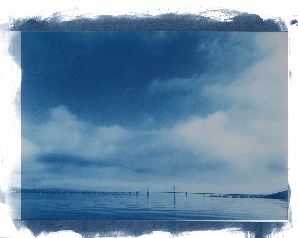
Below is an untoned version for comparison.
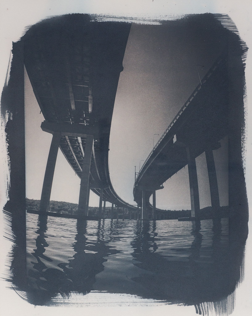
Oak Galls produce a nice dark black color. I think this ended up a little too dark, but I really like the inky black water.
Below again is an untoned version for comparison.
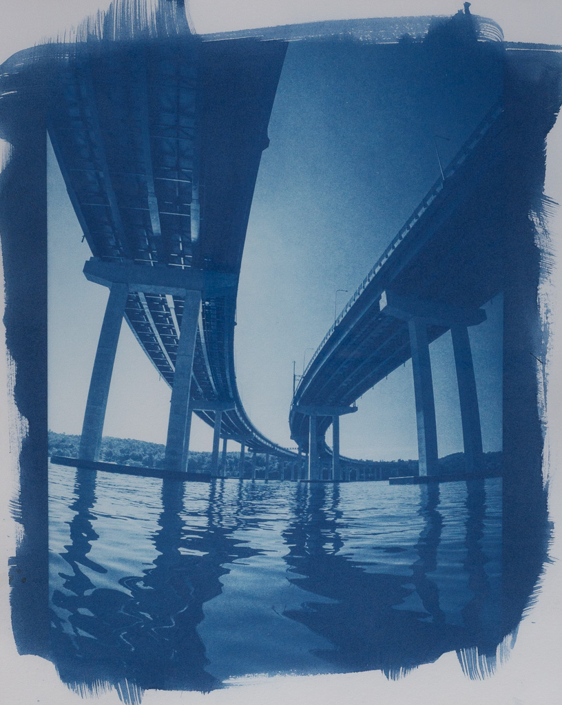
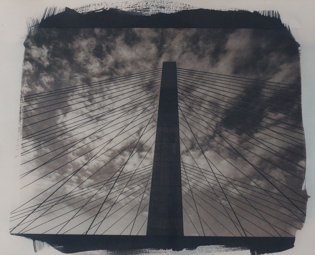
Here's another w/ Oak Galls, again a bit dark.
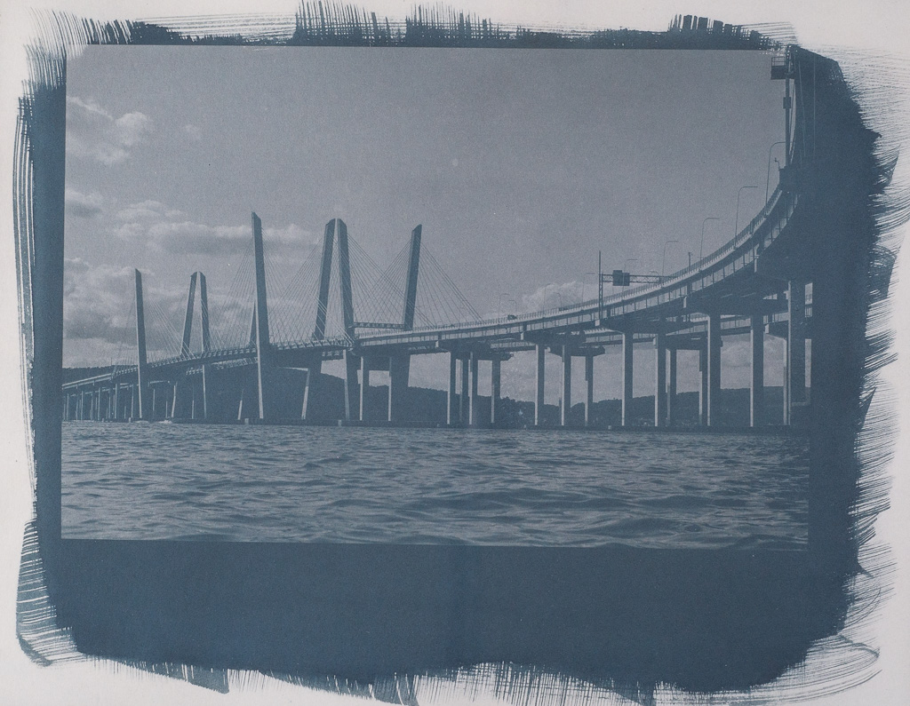
Logwood I thought would be darker, maybe it needs more time. To me it looks a little washed out, but, maybe it's worth more exploration.
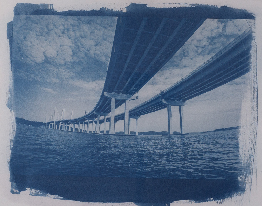
Here's a bonus bridge cyanotype untoned.